


A book cover is often the first real interaction a reader has with a book, long before they understand the story, message, or value inside it. In many cases, the cover is not just a visual element—it is the decision-making trigger. Readers frequently judge whether a book is worth exploring within a few seconds, and that judgment is shaped almost entirely by cover design.
Because of this, book cover design is not simply about aesthetics. It is about communication, positioning, and psychological impact. A winning book cover does not just look attractive; it conveys meaning, sets expectations, and builds curiosity strong enough to make a reader stop scrolling and start considering.
Understanding what makes a cover effective is essential for anyone involved in publishing or content creation. The best book covers are not accidental—they are built on deliberate design concepts that align with reader behavior and genre expectations.
Genre-Specific Cover Expectations
One of the most important realities in book cover design is that different genres follow different visual languages. Readers may not consciously analyze these patterns, but they instantly recognize when a cover “feels right” for a category. This is because over time, each genre has developed its own set of visual expectations based on repeated exposure across bookstores, platforms, and recommendations.
A book cover that aligns with these expectations is easier to understand at a glance. A cover that ignores them often creates confusion, even if the design itself is visually strong. This is why genre awareness is not optional in cover design—it directly influences whether a reader trusts the book enough to explore it further.
Fiction vs Non-Fiction Visual Direction
Fiction and non-fiction covers serve fundamentally different communication goals, and this difference shapes their visual approach.
Fiction covers are designed to evoke emotion, atmosphere, and narrative curiosity. They often rely on symbolic imagery, mood-driven color palettes, and conceptual design elements that hint at story rather than explain it directly. The goal is not to summarize the book but to suggest a world or experience the reader can enter.
Non-fiction covers, on the other hand, prioritize clarity and credibility. They tend to focus on strong typography, structured layouts, and direct messaging. Instead of creating mystery, they aim to establish authority and make the subject immediately understandable. The reader should be able to identify the topic within seconds without needing interpretation.
This contrast exists because fiction sells experience, while non-fiction sells knowledge or solutions.
Genre-Based Visual Cues in Practice
Each genre carries its own visual shorthand, which helps readers instantly categorize and evaluate a book. These cues are not strict rules, but they are widely recognized patterns that shape reader expectations.
Romance covers often emphasize emotional tone through warm color palettes, soft lighting, and imagery that suggests intimacy or connection. The focus is usually on emotional tension rather than literal storytelling details.
Thriller and mystery covers typically lean toward darker tones, high contrast visuals, and minimal but impactful imagery. They often use tension-building composition, where negative space and shadow play an important role in creating suspense.
Self-help and personal development covers usually rely on clean layouts, bold typography, and structured visual balance. The design often communicates clarity, growth, or transformation through simple but strong visual hierarchy.
Fantasy covers tend to be more illustrative and immersive, often featuring detailed scenes, symbolic objects, or world-building elements. These covers aim to transport the reader into an entirely different setting before they even open the book.
Each of these approaches works because it matches what readers already expect from that genre.
Why Visual Mismatch Reduces Reader Trust
When a book cover does not align with genre expectations, it creates an immediate sense of uncertainty. Even if the design is visually appealing, the mismatch forces the reader to pause and question what the book is actually about.
This hesitation is critical because cover interaction happens quickly. Readers rarely spend time decoding unclear signals. Instead, they rely on fast recognition patterns. If a cover suggests the wrong genre or tone, the reader may assume the content inside will not match their interest and move on.
This is why visual consistency with genre conventions is closely tied to trust. A well-aligned cover feels familiar and reliable, while a mismatched one feels uncertain or misleading.
However, this does not mean creativity is limited. Strong cover design often works within genre expectations while still introducing unique elements that make the book stand out. The key is balance—recognizable structure combined with distinct identity.
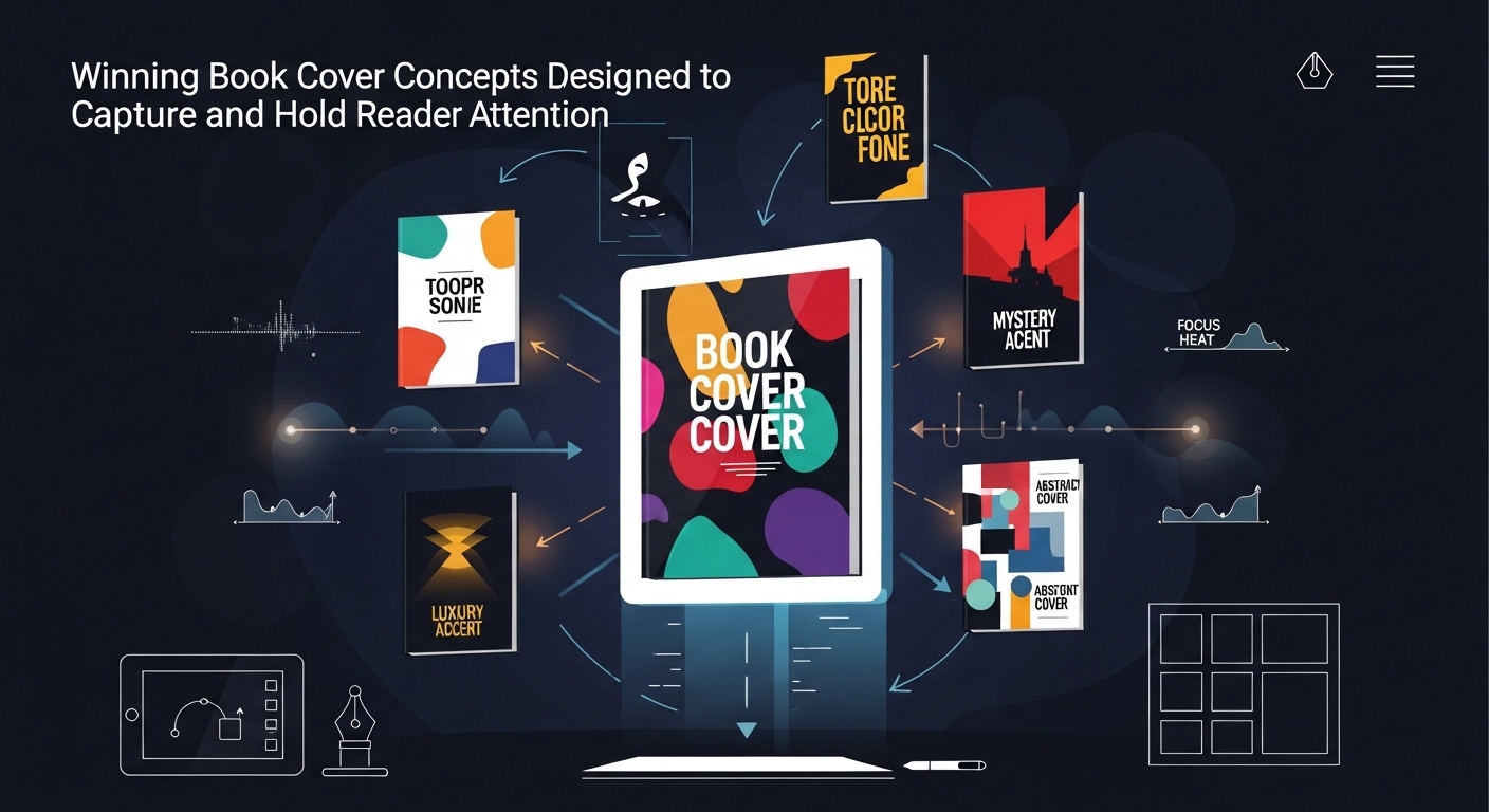
What Makes a Book Cover “Winning” in Practice
A winning book cover is one that successfully achieves two things at the same time. First, it captures attention in a crowded environment where multiple books are competing for visibility. Second, it communicates the essence of the book clearly enough to attract the right audience.
This means effectiveness is not measured only by visual beauty. A visually impressive cover that fails to represent the book accurately will not perform well in the long term. Similarly, a conceptually accurate cover that lacks visual appeal may be ignored entirely.
Strong book cover design sits at the intersection of psychology, storytelling, and visual hierarchy. Every element—color, typography, composition, and imagery—contributes to how the reader perceives the book in a matter of seconds.
The Role of Visual First Impressions in Book Covers
When a reader encounters a book cover, the brain processes visual information before anything else. This first impression forms almost instantly and strongly influences whether the reader continues engaging with the book or moves on.
Why First Impressions Matter So Much
First impressions are powerful because they operate at a subconscious level. Readers do not consciously analyze every design detail; instead, they form a quick emotional response based on overall appearance.
If a cover feels visually confusing or inconsistent, it creates hesitation. If it feels clear, balanced, and visually aligned with expectations, it creates trust and interest.
This is why successful book covers often rely on simplicity and clarity rather than excessive detail. The goal is not to overwhelm the viewer but to guide their attention toward a single, strong impression.
Core Design Elements That Shape Winning Book Covers
Effective book covers are built using a combination of design principles that work together to communicate meaning and attract attention. These elements must function as a unified system rather than separate visual choices.
Typography as a Meaning Carrier
Typography is one of the most influential elements in cover design because it directly communicates tone. The style of lettering can suggest genre, emotional tone, and even pacing.
For example, bold and structured fonts often suggest strength or seriousness, while softer or more stylized fonts may indicate creativity or emotional depth. The choice of typography affects how the reader interprets the book before reading a single word of description.
In strong cover design, typography is not treated as decoration. It is treated as a core storytelling element.
Color Psychology and Emotional Response
Color plays a significant role in shaping emotional perception. Different colors trigger different associations in the reader’s mind, which is why color selection is never random in effective cover design.
Darker tones often create a sense of mystery, seriousness, or intensity. Brighter tones may suggest energy, optimism, or accessibility. Subtle or muted palettes can communicate sophistication or emotional depth.
The key is not just choosing attractive colors but selecting colors that align with the book’s tone and message. When color and content are aligned, the cover feels more coherent and intentional.
Imagery and Conceptual Symbolism
Imagery is often the most immediately noticeable element of a book cover. However, in successful designs, imagery is not just decorative—it is symbolic.
Instead of directly illustrating every aspect of the story or content, strong covers often use visual metaphors. These symbols create curiosity while still hinting at the book’s central theme.
This approach allows the cover to remain visually clean while still carrying conceptual depth. It invites the reader to interpret meaning rather than simply observe it.
Common Book Cover Concepts That Capture Attention
Certain design approaches consistently perform well because they align with how readers process visual information. These concepts are not rules, but they are widely used because they are effective in real-world publishing environments.
Minimalist Concept Designs
Minimalist covers rely on simplicity, clear spacing, and strong focal points. Instead of filling the cover with multiple visual elements, they focus on one dominant idea or image.
This approach works because it reduces visual noise. The reader’s attention is directed immediately toward a single concept, making the cover easier to process and remember.
Minimalist designs are especially effective in modern digital environments where readers scroll quickly through large amounts of content.
Character-Focused Covers
Some of the most engaging book covers feature a central character as the main visual element. This approach works particularly well in fiction because it immediately establishes emotional connection.
A well-designed character cover does not just show a person; it suggests personality, mood, and story direction. Even without context, the reader begins to form assumptions about the narrative.
This emotional suggestion is what makes character-driven covers so powerful.
Symbolic and Abstract Designs
Symbolic covers rely on meaning rather than literal representation. Instead of showing characters or scenes directly, they use objects, shapes, or abstract visuals to represent themes.
This approach works especially well for conceptual or literary books where interpretation is part of the reading experience. It also creates curiosity because the meaning is not immediately obvious.
Readers are naturally drawn to visuals that require interpretation, making this style effective for engagement.
How Book Covers Influence Reader Decision-Making
Book covers play a direct role in decision-making because they reduce uncertainty. When a reader sees a cover, they quickly assess whether the book matches their expectations or interests.
A strong cover reduces hesitation by clearly signaling genre, tone, and content type. This allows the reader to make faster and more confident decisions.
Poorly designed covers, on the other hand, increase uncertainty. If a reader cannot quickly understand what the book represents, they are more likely to ignore it regardless of the content quality inside.
Balancing Creativity with Market Expectations
One of the most important aspects of book cover design is balancing originality with familiarity. Readers expect certain visual cues depending on genre, and ignoring these expectations can reduce effectiveness.
At the same time, overly generic designs fail to stand out. The most successful covers find a balance between recognizable genre patterns and unique visual identity.
This balance ensures that the cover feels both familiar enough to be understood and distinctive enough to be remembered.
Mini Case Examples of Effective Book Cover Concepts
Understanding book cover design becomes significantly easier when abstract principles are translated into real, applied scenarios. Instead of only describing elements like color, typography, or composition, it helps to see how these decisions come together in actual cover concepts. The following examples break down how different genres use visual strategy to communicate meaning instantly.
Mystery Novel Cover Concept: Dark Palette with Symbolic Focus
A mystery novel cover typically aims to create curiosity, tension, and a sense of unresolved narrative. One effective approach is to use a dark or muted color palette as the foundation. Shades like deep blue, charcoal, or near-black are commonly used because they naturally suggest secrecy and uncertainty.
Within this visual environment, the design often focuses on a single dominant object rather than multiple elements. This could be something like a closed door, a broken object, a shadowed figure, or an isolated clue-related item. The purpose of using a single focal point is to create psychological tension—inviting the reader to ask questions rather than providing answers.
Typography in this type of cover is usually bold but restrained. It is positioned in a way that does not compete with the central visual element. The spacing is often intentional and slightly minimal, reinforcing the feeling of emptiness or mystery.
The overall effect is not to explain the story but to create an emotional trigger. The reader should feel curiosity and uncertainty within seconds of seeing the cover, which encourages further exploration.
Self-Help Book Cover Concept: Clean Structure with Visual Direction
Self-help or personal development covers rely heavily on clarity and instant readability. The primary goal is to communicate transformation, growth, or improvement in a way that feels structured and accessible.
A common design approach involves a clean, light background paired with strong, highly readable typography. Fonts are usually bold, modern, and simple, ensuring that the title remains the most dominant visual element. There is minimal decorative distraction because the focus is placed on message clarity.
To visually reinforce the idea of progress or improvement, designers often incorporate abstract upward movement elements. This could be represented through geometric shapes, subtle arrows, rising lines, or gradient transitions that suggest movement from low to high.
Color choices are also intentional. Brighter tones or balanced contrast combinations are often used to create a sense of optimism and motivation. Unlike fiction covers, the goal here is not emotional ambiguity but psychological clarity.
The result is a cover that communicates trust, direction, and usefulness instantly. The reader should immediately understand that the book is practical and solution-oriented.
Why These Concepts Work in Real Design Contexts
Both examples demonstrate how effective cover design is not random but structured around reader psychology. In the mystery example, uncertainty is deliberately created to drive curiosity. In the self-help example, clarity is prioritized to build trust and immediate understanding.
What makes these approaches effective is alignment between visual language and reader expectation. When the design matches what the reader subconsciously expects from a genre, comprehension becomes instant. When it does not, the reader is forced to interpret, which often leads to disengagement.
These mini cases highlight a core principle of book cover design: the best covers do not just look good—they communicate the book’s identity within seconds.
Frequently Asked Questions (FAQs)
What makes a book cover effective?
A book cover is effective when it captures attention quickly and clearly communicates the book’s genre, tone, or theme in a visually compelling way.
Why is book cover design important?
Book cover design is important because it directly influences first impressions and reader decisions, often determining whether a book is explored further or ignored.
Do simple book covers work better?
Simple covers often perform well because they reduce visual clutter and make it easier for readers to focus on the main concept or message.
How does typography affect book covers?
Typography influences how a book is perceived emotionally and stylistically. It helps communicate tone even before the reader engages with the content.
Should book covers follow trends?
While trends can be useful, effective covers balance current design trends with timeless principles to ensure long-term appeal and relevance.


