


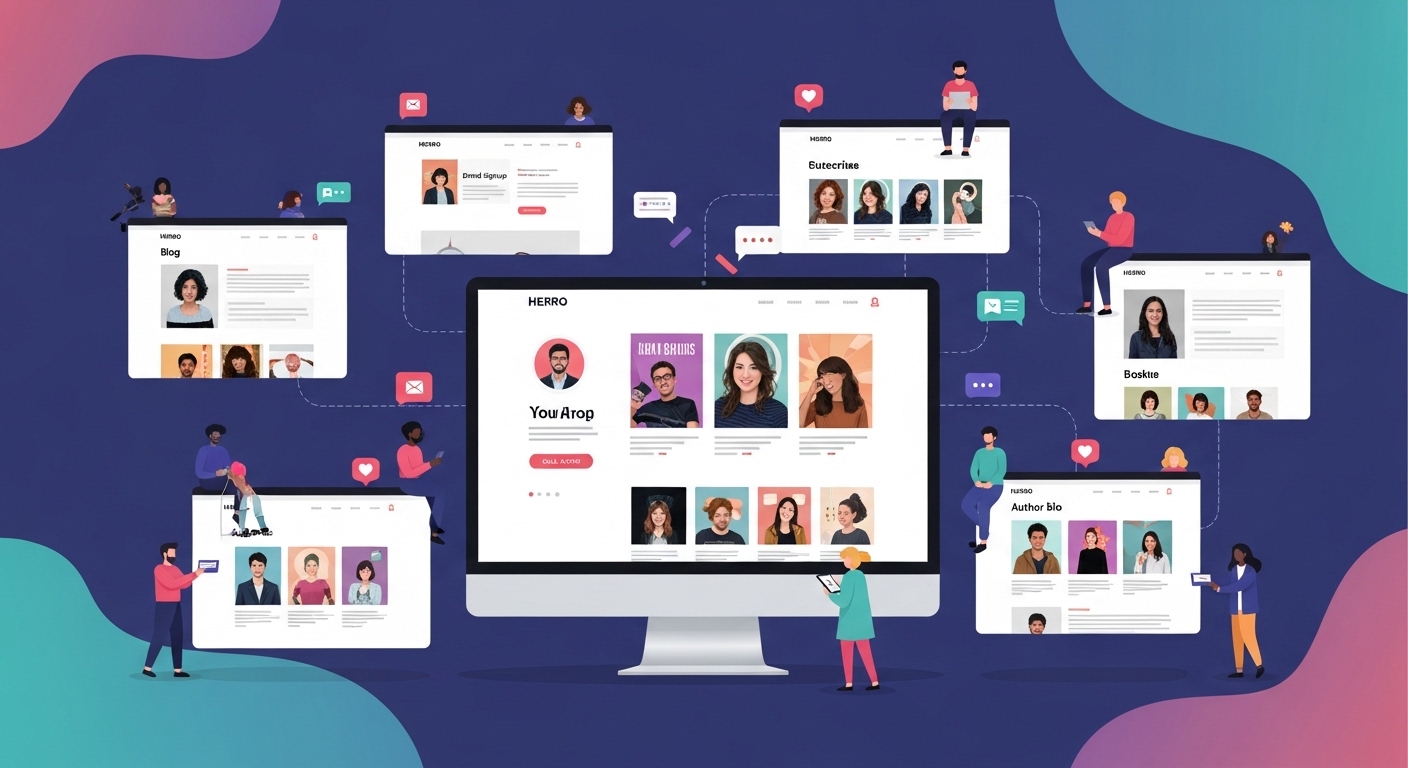
An author website is no longer just a digital business card—it is a central hub where readers form their first real impression of a writer. In 2026, readers expect more than a static page with a biography and book list. They want connection, personality, and a reason to stay engaged beyond a single visit.
The most effective author websites do not just present information. They create an experience that reflects the author’s voice, genre, and relationship with their audience. Whether the goal is to build a loyal readership, promote books, or establish authority, the structure and design of an author website play a critical role.
What separates average websites from exceptional ones is not complexity, but intentionality. Every section, visual element, and piece of content is designed to guide the reader toward deeper engagement.
What Makes an Author Website Truly Exceptional
A strong author website works because it balances clarity with personality. Readers should immediately understand who the author is, what they write, and why it matters—without needing to search for that information. At the same time, the site must feel distinct. Generic layouts and vague messaging fail to create connection. Exceptional websites use tone, visuals, and content structure to reflect the author’s identity and writing style. Another key factor is usability. If a reader cannot easily navigate the site or find essential information, the connection breaks. A well-designed author website removes friction and encourages exploration.
25 Exceptional Author Website Examples
Below are 25 author websites that demonstrate different approaches to building reader connection. Each example highlights a specific strength rather than just visual appeal.
1–5: Clean and Minimalist Design Approaches
Clean and minimalist author websites are built on the principle that less visual noise leads to stronger reader focus. Instead of overwhelming visitors with multiple elements, these designs guide attention deliberately using spacing, typography, and hierarchy. Research in user experience (UX) consistently shows that users form opinions about a website within seconds, and cluttered layouts increase cognitive load, making it harder for them to process information quickly.
Minimalist design works particularly well for author websites because the goal is not to impress with complexity, but to make the author’s work—books, voice, and message—stand out clearly.
Example 1: Clean Layout with Bold Typography
A clean layout combined with bold typography ensures that the most important information—usually book titles or author name—is immediately visible. Studies in visual hierarchy show that users naturally scan pages in predictable patterns, often focusing first on large, high-contrast text.
By using bold typography, these websites create a clear entry point for the reader’s attention. Instead of searching for key information, visitors are guided directly toward it. This reduces friction and improves engagement, especially for first-time visitors who are deciding whether to explore further.
Example 2: Strategic Use of White Space
White space, often misunderstood as “empty space,” is actually a critical design tool. Research in readability and interface design shows that proper spacing between elements improves comprehension and reduces mental fatigue.
In minimalist author websites, white space is used to:
- Separate sections clearly
- Improve text readability
- Create a calm and focused browsing experience
When content is not crowded, readers can process information more comfortably. This is particularly important for authors, where text-heavy sections like bios or book descriptions need to feel accessible rather than overwhelming.
Example 3: Limited Color Palette for Focus
Using a minimal color palette helps maintain visual consistency and prevents distraction. Color psychology research suggests that too many competing colors can divide attention and reduce clarity.
By limiting colors, these websites:
- Keep focus on content rather than decoration
- Strengthen brand identity through consistent visual tone
- Make important elements (like buttons or titles) stand out more effectively
A restrained color scheme also makes the website feel more professional and intentional, which can positively influence how readers perceive the author.
Example 4: Single Strong Visual on the Homepage
Minimalist designs often rely on one dominant visual element rather than multiple competing images. This approach is supported by studies on attention focus, which show that users engage more effectively when there is a clear focal point.
A single strong visual—such as a book cover, portrait, or thematic image—serves multiple purposes:
- It immediately communicates the author’s genre or tone
- It creates a memorable first impression
- It anchors the rest of the page visually
By avoiding multiple visuals, the design ensures that attention is not divided, making the message clearer and more impactful.
Example 5: Readability Across All Sections
Readability is one of the most important factors in user retention. Research shows that users are more likely to stay on a website if content is easy to scan and understand quickly.
Minimalist author websites prioritize readability by:
- Using clear font choices and appropriate text sizes
- Maintaining strong contrast between text and background
- Structuring content into digestible sections
This approach aligns with how users actually read online—by scanning rather than reading word-for-word. When content is easy to navigate, readers are more likely to continue exploring the site.
Why Minimalist Designs Perform So Well
The effectiveness of minimalist author websites is not just aesthetic—it is rooted in how people process information. By reducing cognitive load, improving visual hierarchy, and guiding attention intentionally, these designs make it easier for readers to engage with content.
In practical terms, minimalist websites:
- Help users find information faster
- Reduce confusion and frustration
- Increase time spent on the site
- Improve overall user experience
For authors, this means a higher chance that visitors will move from browsing to deeper engagement, whether that involves exploring books, reading more content, or returning to the site later.
.6–10: Personality-Driven Author Websites
Personality-driven author websites go beyond structure and design—they focus on voice, identity, and emotional connection. In contrast to minimalist or purely functional sites, these websites aim to make readers feel like they are interacting with a real person, not just a brand or content catalog.
Research in digital behavior and reader engagement consistently shows that users are more likely to trust, remember, and return to platforms that feel human and relatable. For authors, this is especially important because readers are not just buying books—they are investing in a voice, a perspective, and often a long-term relationship.
These websites succeed because they reduce distance between the author and the reader, making the experience feel more direct and personal.
Example 6: Conversational Tone Across All Sections
Websites that use a conversational tone create immediate accessibility. Instead of sounding formal or distant, the writing feels like a direct interaction with the reader. This approach aligns with how people naturally communicate, especially in digital environments.
From a behavioral standpoint, conversational language reduces perceived effort. Readers do not have to interpret complex phrasing or formal structures—they can engage quickly and intuitively.
This tone is often reflected in:
- Homepage introductions that feel like a personal greeting
- Casual, direct language instead of overly polished phrasing
- A writing style that mirrors natural speech patterns
The result is a website that feels welcoming rather than transactional, which encourages users to stay longer and explore further.
Example 7: Personal Insights and Storytelling in the Bio
Traditional author bios often focus on credentials, achievements, and formal background. Personality-driven websites take a different approach by incorporating storytelling and personal insights.
Research in narrative psychology shows that people connect more deeply with stories than with factual summaries. When an author shares personal experiences, motivations, or challenges, readers are more likely to form an emotional connection.
This type of bio often includes:
- The author’s journey into writing
- Personal struggles or turning points
- Motivations behind their work
These elements make the author more relatable and memorable, transforming the bio from a static description into a meaningful narrative.
Example 8: Visuals That Match the Author’s Genre
Visual consistency plays a critical role in reinforcing identity. Personality-driven websites use imagery, color schemes, and design elements that align with the author’s genre and tone.
For example, a fantasy author may use immersive, atmospheric visuals, while a self-help writer may lean toward clean, structured designs. This alignment helps readers instantly understand what to expect.
From a cognitive perspective, this reduces uncertainty. When visuals match expectations, users feel more confident in their interpretation of the content.
It also strengthens brand identity, making the website more cohesive and easier to remember.
Example 9: Behind-the-Scenes Content
Behind-the-scenes content adds depth to the reader experience by revealing the process behind the work. Instead of only presenting finished products, these websites show how ideas develop, how books are written, or what inspires the author.
This type of content increases engagement because it:
- Creates transparency and authenticity
- Invites readers into the creative process
- Encourages ongoing interaction rather than one-time visits
From an engagement standpoint, behind-the-scenes content often leads to repeat visits, as readers become interested not just in the final output but in the journey itself.
Example 10: Consistent Tone Across Pages
Consistency is one of the most important elements in building trust. A website that shifts tone between pages can feel disjointed and less reliable.
Personality-driven websites maintain a unified voice across all sections, whether it is the homepage, bio, blog, or book descriptions. This consistency reinforces the author’s identity and makes the experience feel intentional.
Consistency is reflected in:
- Language style and vocabulary
- Emotional tone (e.g., humorous, serious, reflective)
- Messaging across different sections
When readers encounter a consistent voice, it strengthens recognition and builds familiarity, which are key factors in long-term engagement.
Why Personality-Driven Websites Build Stronger Connections
The effectiveness of these websites lies in their ability to humanize the author. Instead of presenting information in a detached way, they create a sense of interaction and relatability.
From a reader behavior perspective, this leads to:
- Increased trust and credibility
- Stronger emotional engagement
- Higher likelihood of return visits
- Deeper interest in the author’s work
In a digital environment where users are constantly exposed to content, personality becomes a differentiating factor. Authors who suc
11–15: Strong Book Presentation and Sales-Focused Websites
Websites in this category are designed with a clear priority: making books easy to discover, understand, and explore without friction. Unlike personality-driven sites that focus on connection first, these websites are structured around clarity, conversion, and user flow.
Research in user experience and digital commerce shows that when users cannot quickly locate or understand a product, they disengage. In the context of author websites, this means readers must be able to identify available books, understand what they offer, and navigate between them effortlessly. Strong book presentation reduces decision fatigue and increases the likelihood of deeper exploration.
Example 11: Clear Sections for Each Book
When each book is given its own dedicated space, the website becomes easier to navigate and more structured. Instead of presenting books in a crowded or unorganized layout, clear sections allow readers to focus on one title at a time.
This approach improves comprehension because:
- Readers can process information without distraction
- Each book receives equal visibility and importance
- Navigation feels intentional rather than overwhelming
From a usability perspective, separation of content reduces cognitive load, making it easier for visitors to engage with multiple titles without confusion.
Example 12: Summaries That Create Curiosity
Book summaries play a crucial role in converting interest into engagement. Instead of simply explaining the plot or topic, effective summaries are written to create curiosity and emotional intrigue.
Research in reader psychology shows that curiosity-driven content increases engagement because it encourages users to seek resolution. A strong summary does not reveal everything—it creates a gap between what the reader knows and what they want to know.
This is often achieved by:
- Highlighting conflict or transformation
- Suggesting stakes without over-explaining
- Using language that triggers emotional interest
When summaries are crafted this way, they function as persuasive tools rather than just informational text.
Example 13: Strong Visuals for Book Covers
Book covers act as primary visual anchors within a website. High-quality, clearly displayed covers help readers quickly identify and differentiate between titles.
From a visual processing standpoint, images are understood faster than text. This means strong visuals can communicate genre, tone, and professionalism instantly.
Effective use of visuals includes:
- High-resolution images that remain clear on all devices
- Consistent sizing for visual balance
- Strategic placement to guide attention
When covers are presented effectively, they not only attract attention but also reinforce the overall credibility of the author.
Example 14: Organized by Series or Category
Organization is critical when authors have multiple books. Structuring content by series or category helps readers understand relationships between titles and navigate more efficiently.
This approach aligns with how users naturally seek information—by grouping related items together. It reduces the effort required to explore multiple books and helps readers identify reading order or thematic connections.
Common organizational strategies include:
- Grouping books by series progression
- Categorizing by genre or theme
- Structuring content to guide sequential reading
This level of organization enhances usability and encourages readers to engage with more than one book.
Example 15: Easy Navigation Between Titles
Navigation plays a direct role in user retention. If readers have to search repeatedly for the next book or return to a main menu, the experience becomes fragmented.
Strong websites create smooth transitions between titles by:
- Linking related books directly
- Providing clear navigation paths
- Reducing the number of steps required to explore
This creates a continuous browsing experience where readers can move naturally from one book to another. The easier it is to navigate, the more likely users are to stay engaged.
Why Sales-Focused Structures Work
The effectiveness of these websites lies in their ability to simplify decision-making. By presenting books clearly, organizing content logically, and reducing friction, they allow readers to focus on interest rather than navigation.
In practical terms, this leads to:
- Faster discovery of books
- Improved understanding of content
- Increased likelihood of exploring multiple titles
- Stronger overall engagement
For authors, this means a more efficient pathway from initial visit to meaningful interaction with their work.
16–20: Interactive and Engagement-Focused Websites
While strong presentation helps readers find books, engagement-focused websites are designed to keep readers returning over time. These websites shift the goal from one-time visits to ongoing interaction, creating a dynamic relationship between the author and the audience.
Research in digital engagement shows that users are more likely to return to platforms that offer fresh content, participation opportunities, and a sense of involvement. For authors, this means moving beyond static pages and creating spaces where readers can interact, respond, and stay connected.
Example 16: Interactive Content or Quizzes
Interactive elements such as quizzes, polls, or personalized recommendations transform passive browsing into active participation. Instead of simply consuming content, users become involved in the experience.
This type of interaction:
- Increases time spent on the website
- Creates a sense of personalization
- Encourages repeat visits
From a behavioral perspective, interactive content activates curiosity and engagement, making the experience more memorable.
Example 17: Blog or Article Sections
Adding a blog or article section allows authors to continuously provide value beyond their books. This keeps the website active and gives readers a reason to return regularly.
Blogs can include:
- Writing insights or reflections
- Expanded ideas related to books
- Commentary on relevant topics
This ongoing content builds authority and strengthens connection by showing the author’s thinking process over time.
Example 18: Reader Feedback and Discussion Opportunities
Websites that allow readers to respond, comment, or share opinions create a two-way interaction rather than a one-sided presentation.
Encouraging feedback:
- Builds a sense of involvement
- Makes readers feel heard and valued
- Creates community-driven engagement
From a psychological standpoint, participation increases emotional investment, making readers more likely to stay connected.
Example 19: Updates and Ongoing Content
Regular updates signal that the website is active and evolving. Static websites often lose engagement because there is no reason for users to return.
Ongoing content may include:
- Book progress updates
- Announcements or insights
- New ideas or short-form content
Consistency in updates builds anticipation and keeps readers engaged over time.
Example 20: Building a Sense of Community
The most effective engagement-focused websites go beyond individual interaction and create a sense of shared space among readers.
This can be achieved through:
- Shared discussions or themes
- Reader involvement in content
- Consistent communication style
When readers feel part of a community, their relationship with the author becomes stronger and more sustained.
Why Engagement-Focused Websites Perform Better Over Time
These websites succeed because they extend the relationship beyond a single visit. Instead of acting as static information hubs, they become evolving platforms where readers can return, interact, and stay connected.
This leads to:
- Higher retention and repeat visits
- Stronger emotional connection
- Increased long-term interest in the author’s work
In a digital environment where attention is limited, sustained engagement becomes one of the most valuable outcomes an author website can achieve.
21–25: Brand-Focused and Visually Distinct Websites
Brand-focused author websites are built around one central idea: recognition. Instead of just presenting information or enabling navigation, these websites aim to create a strong, lasting impression that readers can recall even after leaving the site. In competitive digital environments, memorability becomes a key differentiator, and visual identity plays a major role in achieving that.
Research in branding and visual cognition shows that users are more likely to remember experiences that are visually consistent and emotionally aligned. When a website maintains a unified look and feel, it reduces confusion and strengthens identity. For authors, this means the website becomes an extension of their writing style, genre, and overall presence.
Example 21: Consistent Color Schemes Across Pages
Consistency in color usage is one of the most effective ways to build visual identity. When the same color palette is used across all pages, it creates a cohesive experience that feels intentional and structured.
From a cognitive perspective, repeated exposure to the same colors strengthens recognition. Readers begin to associate those colors with the author, which reinforces brand memory over time.
Consistent color schemes help:
- Create a unified visual experience
- Strengthen brand recall
- Reduce visual confusion across pages
This level of consistency ensures that no matter which page a reader visits, the experience feels connected and familiar.
Example 22: Unique Design Elements
Brand-focused websites often include distinctive design features that set them apart from standard layouts. These elements might include custom typography, unconventional layouts, or subtle visual motifs that reflect the author’s personality or genre.
The purpose of uniqueness is not complexity—it is differentiation. When a website includes elements that are not commonly seen elsewhere, it becomes easier for readers to remember.
These design choices can:
- Create a signature visual style
- Reinforce the author’s identity
- Make the website more engaging and recognizable
However, uniqueness must still support usability. The goal is to stand out without making the experience confusing.
Example 23: Visual Alignment with Genre Expectations
Strong branding does not ignore genre conventions—it works within them. Successful author websites align their visual identity with the expectations of their target audience while still maintaining individuality.
For example, a thriller author may use darker tones and high-contrast visuals, while a romance author may lean toward softer palettes and emotional imagery. This alignment helps readers instantly recognize whether the content matches their interests.
From a usability standpoint, this reduces uncertainty and increases trust. Readers feel more confident engaging with a website when its visuals match what they expect from the genre.
Example 24: High-Quality Imagery
Image quality has a direct impact on perceived credibility. Research in digital design shows that users often judge the professionalism of a website based on visual quality alone.
High-quality imagery enhances:
- Perceived authority and professionalism
- Visual clarity and engagement
- Overall user trust
Blurry, inconsistent, or poorly scaled images can weaken the entire website, even if the content is strong. In contrast, sharp, well-composed visuals elevate the experience and make the site feel more polished.
Example 25: Strong and Consistent Visual Theme
A visual theme is the combination of colors, typography, imagery, and layout working together to create a unified identity. Brand-focused websites maintain this theme across all pages, ensuring that every element feels connected.
Consistency in visual theme:
- Reinforces recognition and memorability
- Creates a seamless browsing experience
- Strengthens the author’s overall brand presence
When all design elements align, the website feels intentional rather than assembled. This cohesion is what transforms a functional site into a memorable one.
Why Brand-Focused Websites Stand Out
The strength of these websites lies in their ability to create a lasting impression. While usability ensures that readers can navigate easily, branding ensures that the experience is remembered.
In practical terms, strong visual identity leads to:
- Higher recall when readers encounter the author again
- Increased perceived professionalism
- Stronger differentiation in crowded digital spaces
For authors, this means that the website does more than present information—it becomes a recognizable extension of their work, helping them stand out and remain memorable over time.
Why Reader Connection Matters More Than Design Alone
While visual appeal is important, connection is what keeps readers engaged. A website that looks good but feels impersonal will not hold attention for long.
Reader connection comes from tone, storytelling, and authenticity. When visitors feel that they understand the author’s voice and perspective, they are more likely to explore further, return later, and eventually engage with the author’s work.
This is why content and design must work together. Design attracts attention, but content builds trust.
How to Apply These Ideas to Your Own Website
Creating an effective author website does not require copying existing designs. Instead, it involves understanding the principles behind them and applying those principles to your own style and goals.
Start by focusing on clarity. Make sure visitors immediately understand who you are and what you offer. Then build from there by adding personality, improving navigation, and refining visual consistency.
The goal is not perfection, but alignment. When all elements of your website work together, the result feels natural and engaging.
Frequently Asked Questions (FAQs)
What should an author website include?
An author website should include a homepage, author bio, book section, and clear navigation. Additional content like blogs or updates can enhance engagement.
Why is an author website important?
It serves as a central platform for connecting with readers, showcasing work, and building a consistent author presence.
How can an author website build reader connection?
By using authentic tone, clear messaging, and engaging content that reflects the author’s personality and writing style.
Do all authors need a website?
While not mandatory, having a website significantly improves visibility and provides a reliable place for readers to learn more.
What makes an author website stand out?
Clarity, consistency, strong visual identity, and genuine connection with readers are key factors that make a website memorable.


